The product page that sells · a 106-page guide
They come to look.Then they leave.
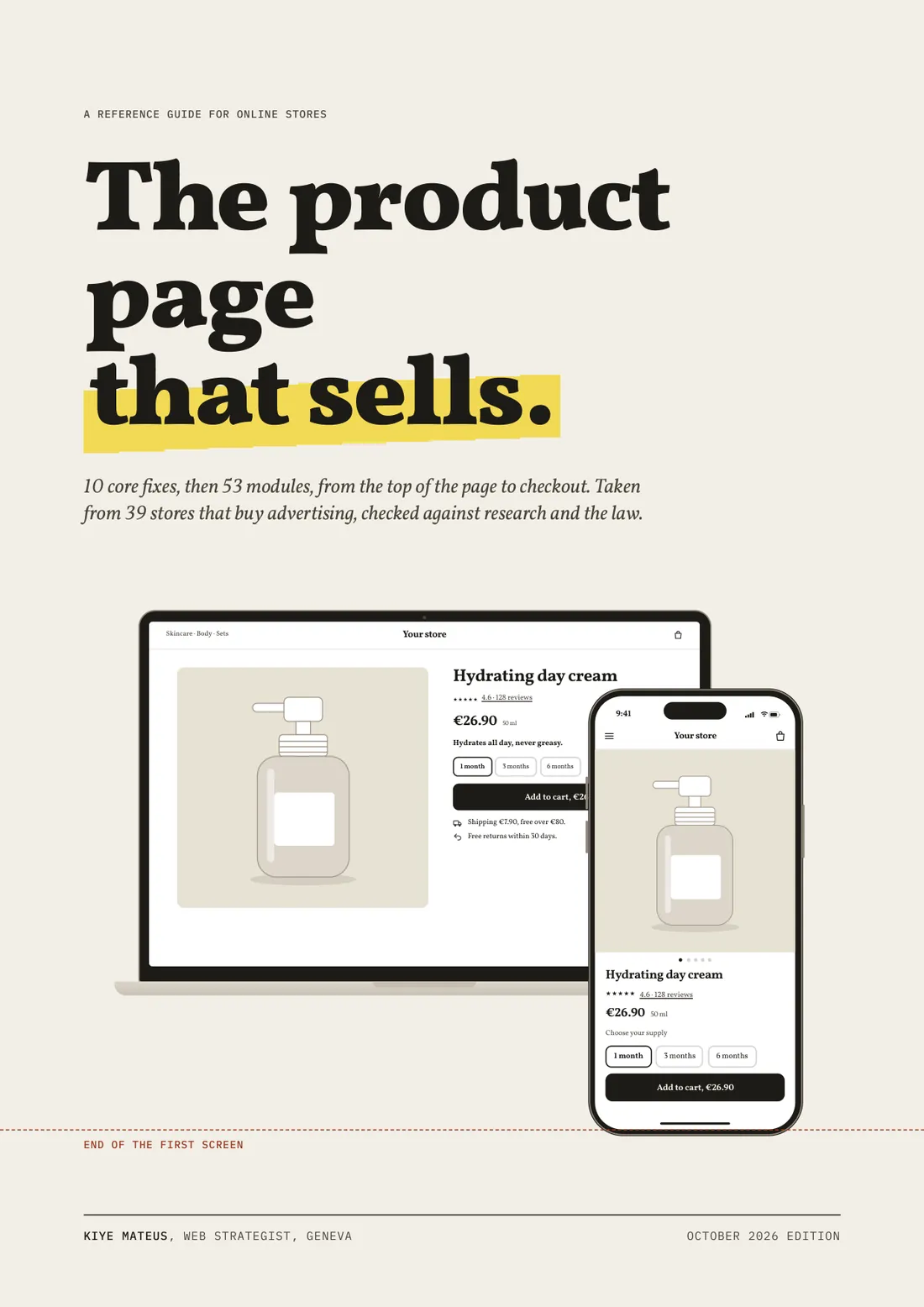
You made a good product, and you pay for people to see it. This guide shows what your page has to say so that they buy it.
Maybe you will recognise yourself here.
- 01
You took care of the product, the photos, the packaging. You believe in it, and you are right to.
- 02
Every day, your ads bring people to your page. Most of them leave without a word.
- 03
You changed a photo, then the button colour, then the copy. Nothing really moved.
- 04
Big brands have teams for this. You have your evenings.
« Your product page does the work of a salesperson. When it hesitates, the customer leaves, and the ad that brought them is paid for anyway. »
Often, the product is not to blame. The sale is lost in precise places on the page, places you stop seeing after looking at them every day. The guide names them one by one, shows what to change, and says honestly what is proven and what is not.
The twelve places where the sale is lost
Found on stores that buy advertising. Each points to the chapter that fixes it in an afternoon.
- 01Displayed price differs from the cartThe price changes in the cart: you feel tricked, you close the tab.Chapter 3
- 02Shipping cost or delivery time missing or contradictoryYou do not know when or how much: you put it off.Chapter 5
- 03Price or button below the second screenYou scroll, you search, you give up.Chapter 1
- 04No reviews on the pageNobody else bought it? You start to doubt.Chapter 6
- 05A pop-up covering the productYou came to see a product, you are asked for an email.Chapter 9
- 06Cart nowhere to be foundYou added it, and now you cannot find anything.Chapter 10
- 07Wall of text before the buttonYou wanted to know what you get, you find a paragraph.Chapter 2
- 08Option picker without a totalYou would have to do the maths. You do not.Chapter 3
- 09Page wider than the screenThe page slides under your thumb: it looks broken.Chapter 10
- 10Mixed language or currencyA word in another language, the wrong currency: you do not feel at home.Chapter 10
- 11Dead linksOne click into nothing, and trust is gone.Chapter 10
- 12No reassurance near the buttonAt the moment of paying, nothing reassures you.Chapter 5
Here is what it changes.
A candle, a tea, a bag: the method adapts to every store. Drag the handle: each marker points to a fix from the guide.

Home · Candles
Cedar candle
4.7 · 86 reviewsCHF 34220 g
Scents a 20 m² room, without black smoke.
Ships within 48 h · free returns for 30 days
Chapters 1, 2 and 4
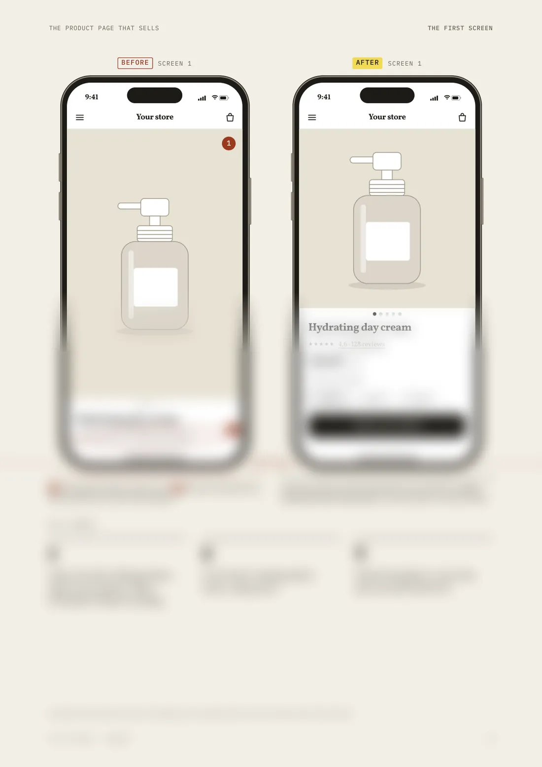
The first screen
Before, you had to scroll to find the price. After, you see it right away.
- 1
MistakeThe photo filled the screen, the price came on the third.
Smaller photo: name, rating and price fit in the first screen.
Why it sellsMeasured
57% of reading time happens in the first screen (Nielsen Norman Group, 2018, 120 participants).
- 2
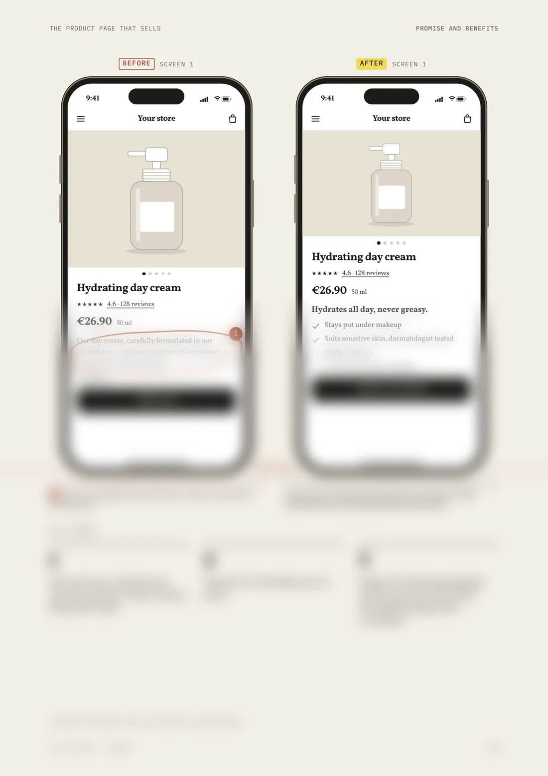
MistakeA generic paragraph that does not say what you get.
One promise and three short benefits.
Why it sellsMeasured
At best 20 to 28% of the words on a page get read (Nielsen Norman Group, 2008): a short promise gets through, a paragraph does not.
- 3
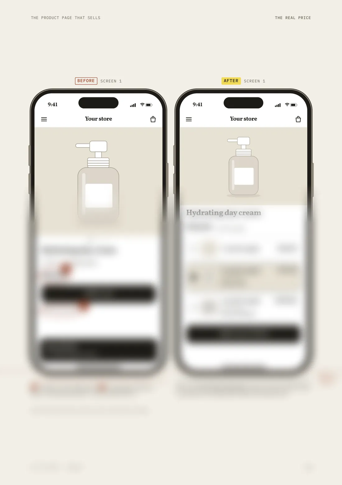
MistakeNo button visible without scrolling.
The button states the price of the chosen option.
Why it sellsObserved
10 of the 14 stores in the panel put the price in the button or the buy bar. No public study measures the effect: measure it on your store.
Fictional stores, products, ratings, reviews and prices, given as an example. Photos: Unsplash.
Leaf through before you buy
Real pages from both documents. The top is readable, the rest awaits you in the document.
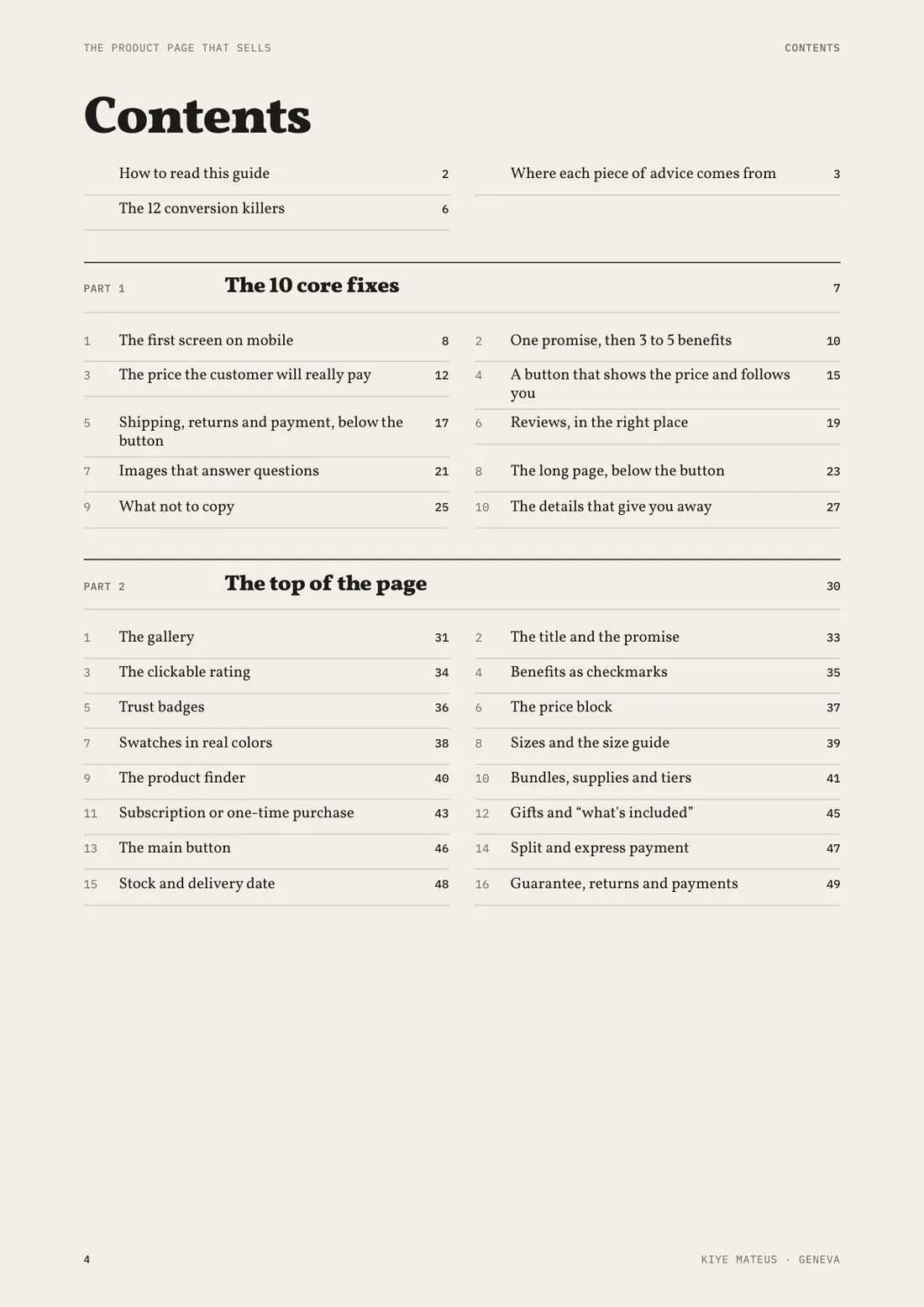
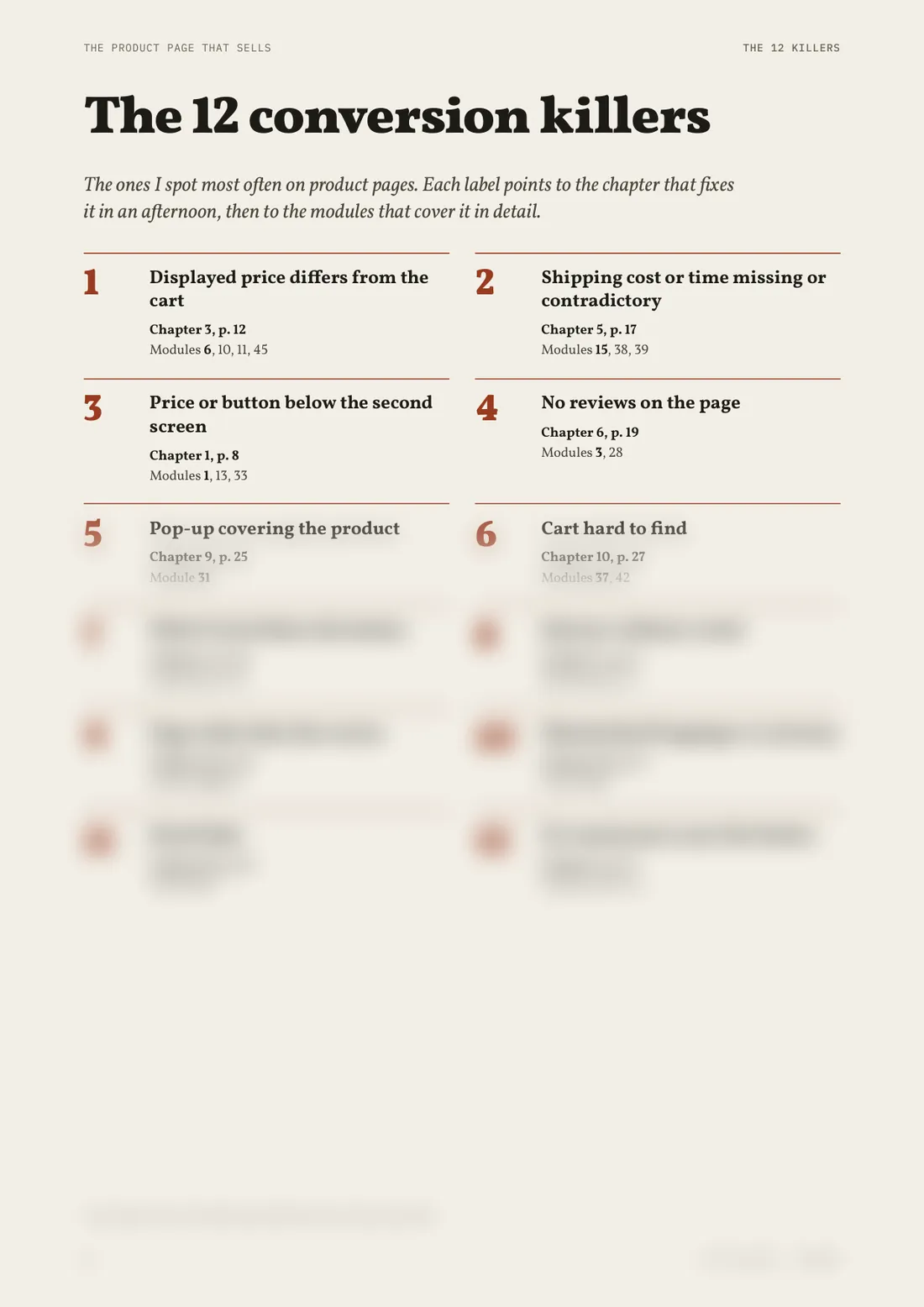 Preview · the rest is in the document
 Preview · the rest is in the document
 Preview · the rest is in the document
 Preview · the rest is in the document
 Preview · the rest is in the document
 Preview · the rest is in the document
 Preview · the rest is in the document
 Preview · the rest is in the document
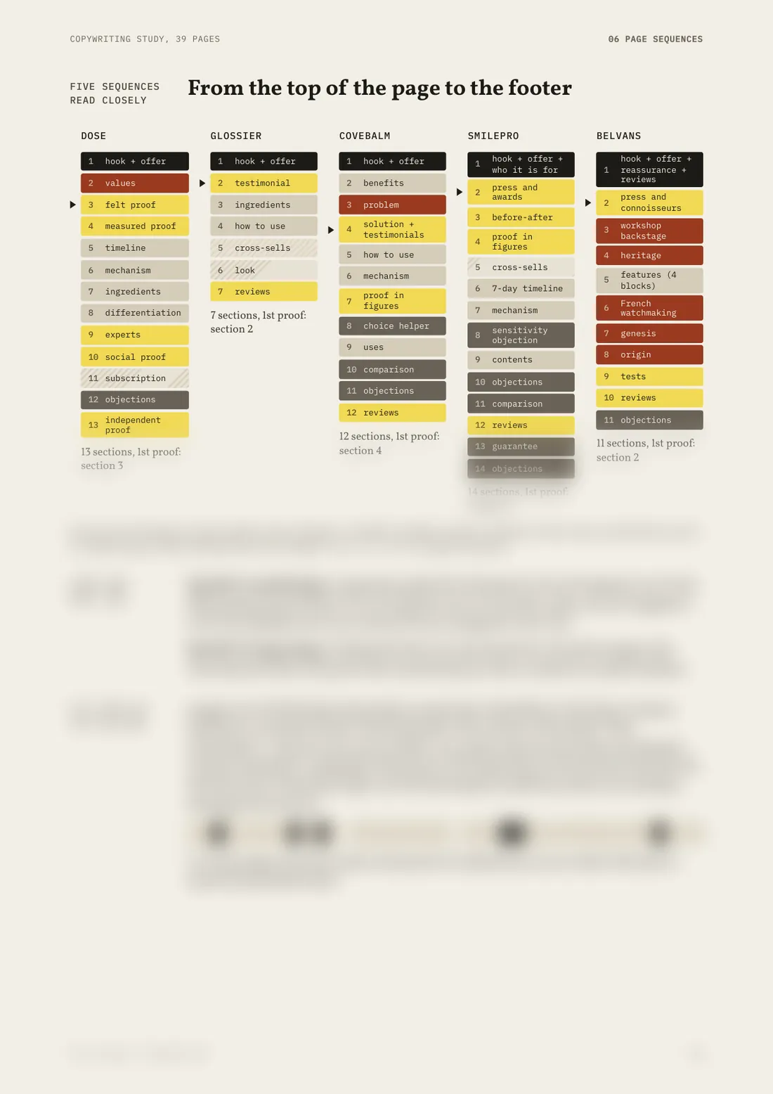 Preview · the rest is in the document
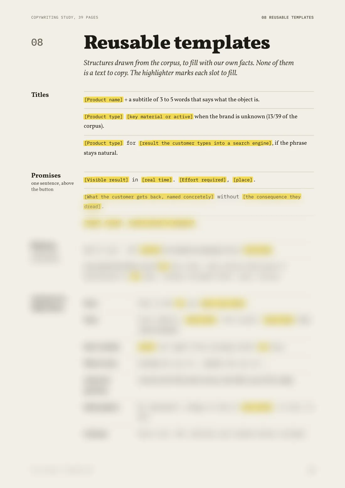 Preview · the rest is in the document
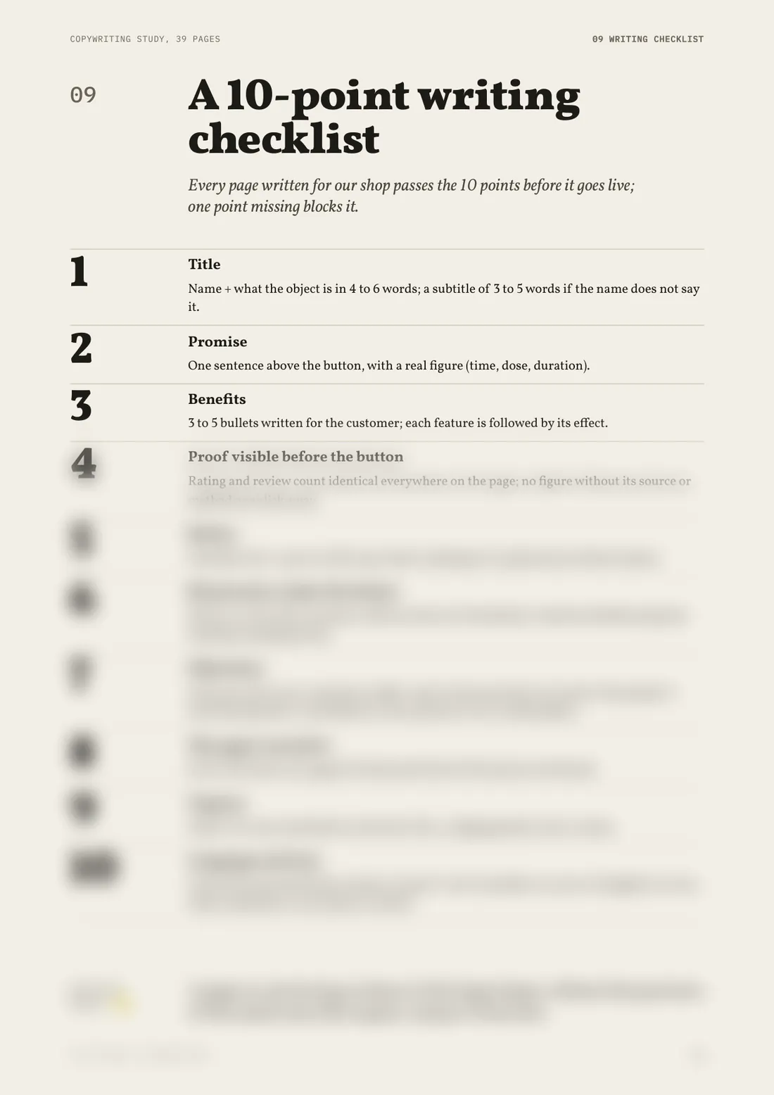 Preview · the rest is in the document
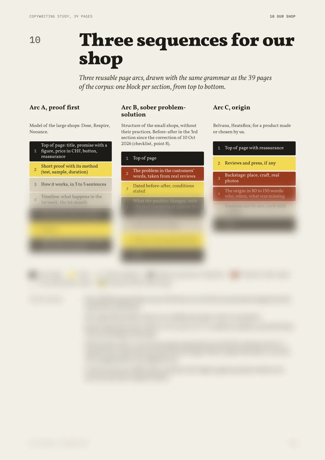 Preview · the rest is in the document
Start with the guide.
Or take both. No subscription, and the price on the tag is the price you pay.
Final price, nothing is added at checkout.
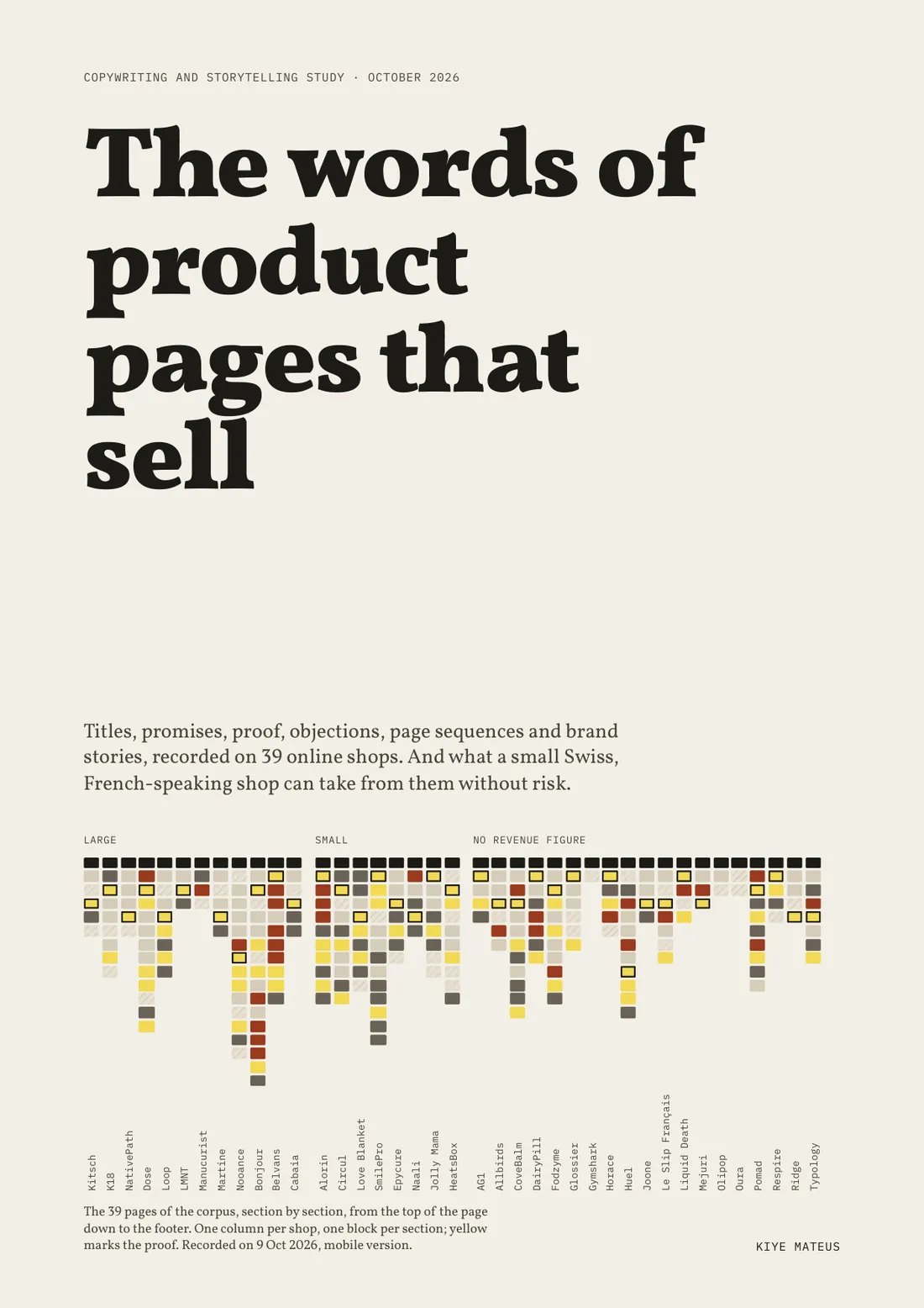
The 39 stores studied
Read in full, from the top banner to the footer, on phone and desktop.
- Kitsch
- K18
- NativePath
- Dose
- Loop
- LMNT
- Manucurist
- Martine
- Nooance
- Bonjour
- Belvans
- Cabaia
- Alorin
- Circul
- Love Blanket
- SmilePro
- Epycure
- Naali
- Jolly Mama
- HeatsBox
- AG1
- Allbirds
- CoveBalm
- DairyPill
- Fodzyme
- Glossier
- Gymshark
- Horace
- Huel
- Joone
- Le Slip Français
- Liquid Death
- Mejuri
- Olipop
- Oura
- Pomad
- Respire
- Ridge
- Typology
Names cited to identify the panel studied. None of these stores is a client or partner, and none has endorsed the guide.
Who wrote these pages

Kiye MateusWeb strategist in Geneva
I, too, wanted to open a store.
And very quickly, one question stopped me: what makes one product page convince, and another let people leave?
- I bought Yomi Denzel’s course.
- And I took that cold shower.
So I stopped guessing.
- 1I went through 39 product pages of stores that buy advertising, from the top banner to the footer, on phone and desktop.
- 2I added each product to the cart to see what came next, without ever paying.
- 3For every piece of advice, I checked whether it was measured, merely observed, or required by law.
Study completed on 9 October 2026.
These pages are the answer I was looking for. I am giving it to you as it is.
Every piece of advice says where it comes from. A store doing something does not prove it works: it may sell thanks to its ads or its price.
The seven evidence labels
- Measured · a study observed the effect on real people
- Recommended · a research institute advises it after testing
- Observed · seen on stores in the panel, with no proof of effect
- Vendor · a figure published by whoever sells the tool
- To test · no public measurement found
- Standard · a published technical threshold, Google or W3C
- Law · a legal text requires or forbids it
If these pages are no use to you, write to me within 14 days: I will refund you, without asking why.
None of the stores mentioned is a client. Mistakes are redrawn without any brand.
Questions before you buy
Another question? Write to mateus@kiye-mateus.com
A4 PDF files, to read on phone or desktop, or to print. The download link arrives by email a few minutes after payment.
Yes. The guide and the study both exist in English and French: choose the language when you buy, the content is the same.
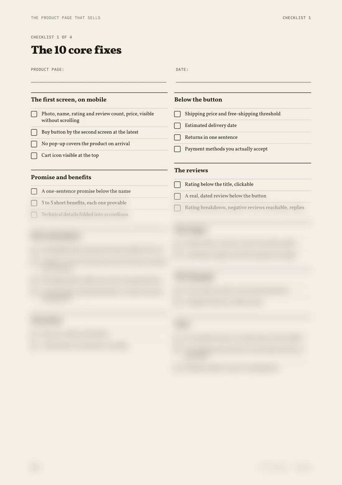
Part 1 brings together ten fixes you can make without a developer, in one afternoon, on your best-selling page. The modules that follow are for when you rebuild your pages.
The guide describes what the page must show and in what order, whatever the tool. It quotes platform-specific measurements where they exist, for instance on mobile speed.
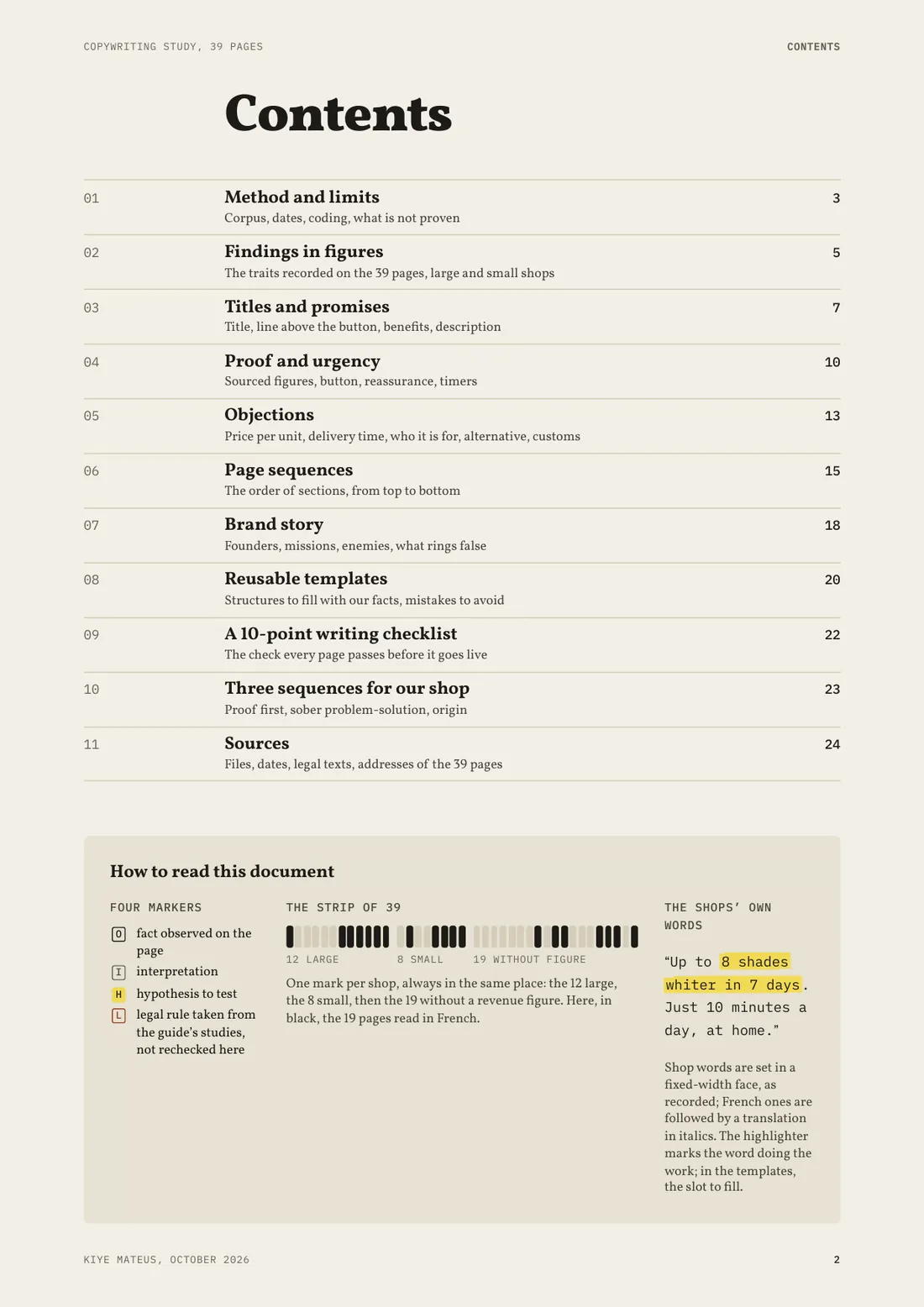
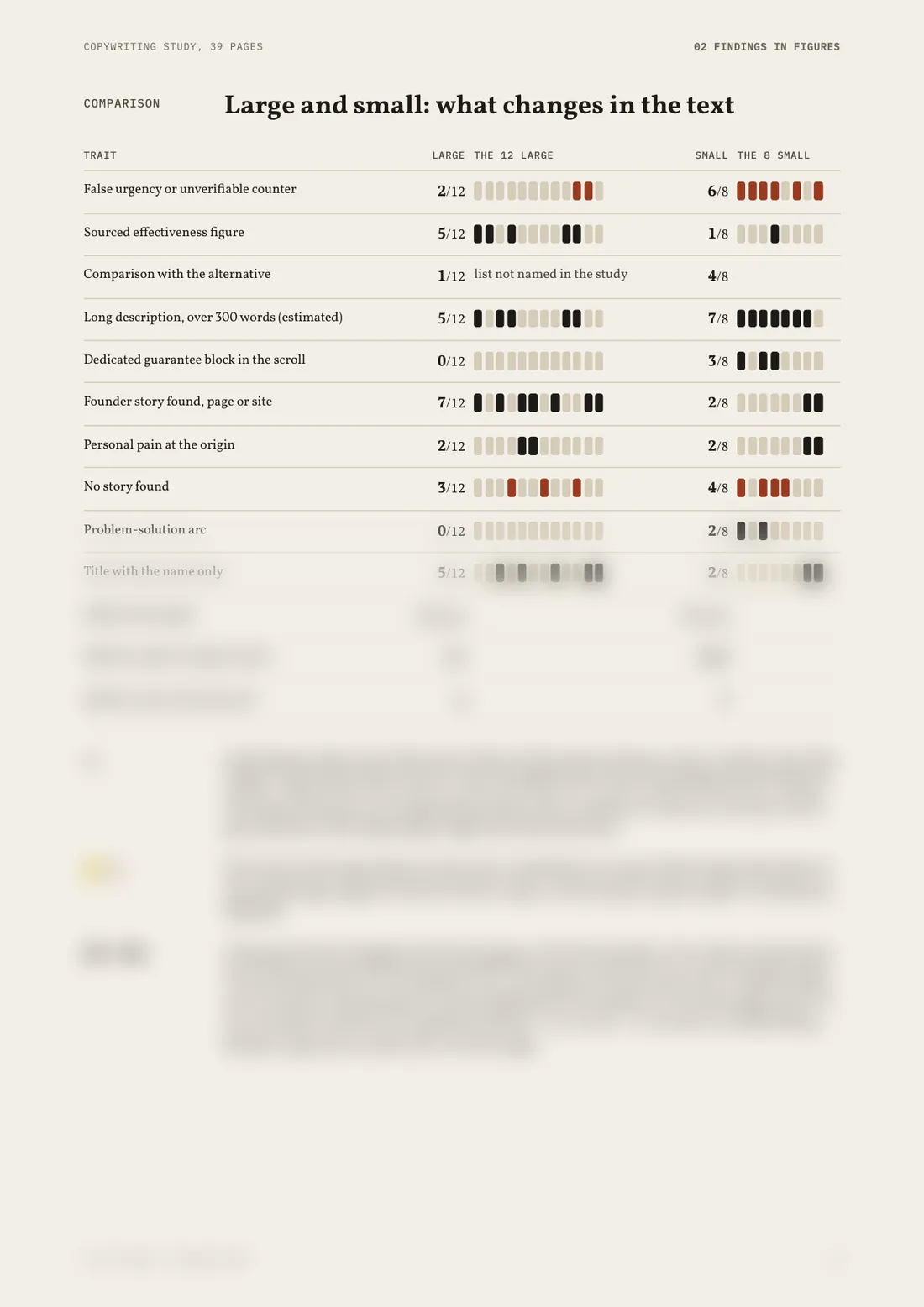
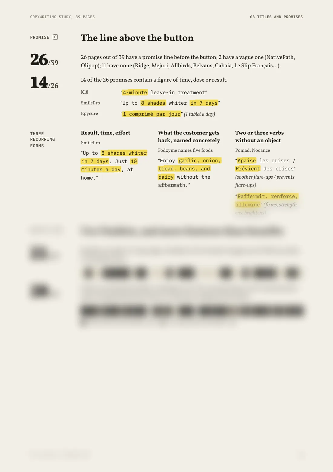
The guide covers the page: first screen, price, button, reviews, cart, checkout. The study covers the words: titles, promises, proof, objections and story, with templates to fill in.
The European Union, France, Belgium and Switzerland, up to date in October 2026. It is general information; for a borderline case you still need a lawyer.
Write within 14 days of buying and you get your money back, no reason needed.
A lot of advice is free, that is true. What is usually missing is the sorting: where the advice comes from, whether it was measured, whether it is legal in Switzerland. The guide does that sorting over 106 pages, sources included. And if it is no use to you, it is refunded within 14 days.
The first 10 fixes take an afternoon. To know whether they work for you, the guide suggests noting four figures for 4 weeks before, then 4 weeks after, changing nothing else in between. No result is promised: every store is different.
Yes. Kiye rebuilds your pages and shows you the demo before you pay. Write with your store’s address.